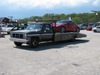

Over my better judgement (and company spending) I hopped into a 200 over a Versa.
The first thing I noticed about this abomination was it propensity to try to kill you at any chance it gets.
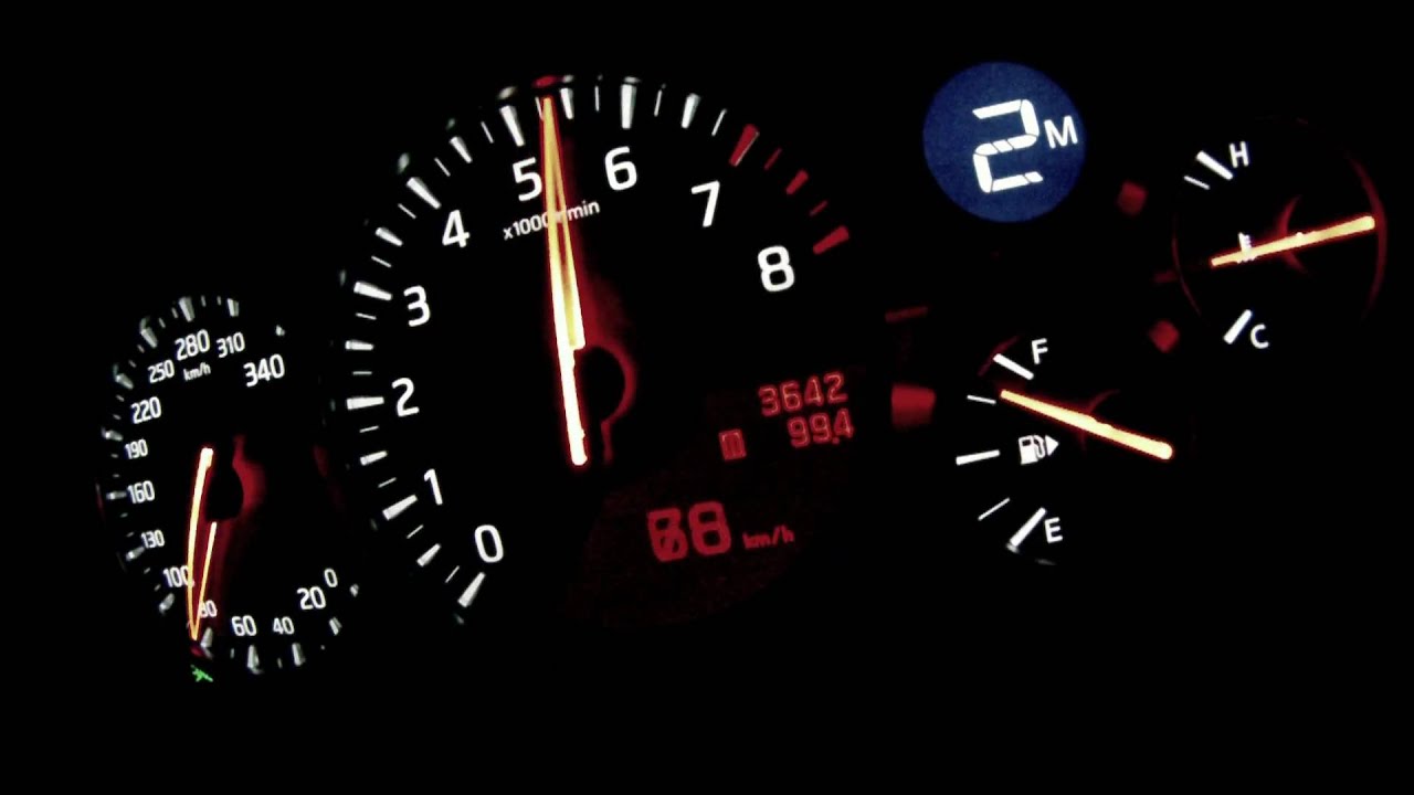
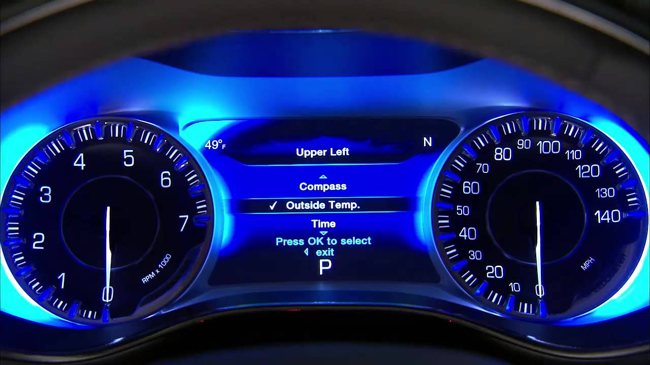
Upon entering and sitting down, you quickly realize that visibility is non-existent over your shoulders or though the rear view. Hell, even looking forwards is a frustrating because as soon as you're looking to where you want to go on a right hand turn, the Texas sized rear view mirror blocks any view of the road, forcing you to duck underneath it to see whats coming. The gauge cluster is just stupid looking with its bullet magazine looking fuel and coolant temp gauges and those lit up tic marks around the numbers on the gauge faces. It feels like you're at the county fair.
While accelerating onto the highway, power delivery is slow. I don't mean like short-bus slow, I mean waiting for your Easy Mac to cool off so you can eat it slow. That downshift takes forever- which is surprising because the transmission is incredibly eager to get into top gear by 15mph in the parking lot. Seriously, 3 gear changes happen one after the other before the speedometer his 10. At cruise, the car would be okay except that the chassis has 5,xxx miles on it and has a constant high pitch rattle under the dash somewhere, a consistent squeek coming from the rear deck or doors (can't tell, don't care), and the wind noise on the side view mirrors fills the cabin. When those things aren't going on, the vibration from expansion joints in the highway echo throughout the car to the point where my fiance on the blue tooth said "WHAT THE HELL IS THAT?!"
However, the worst has yet to come. That same s*** transmission that can't make up its mind is at its absolute worst while decelerating with no throttle, or when decelerating with gentle braking. You'd expect it to chill out and come to a stop light without drama, but nooooooo. The transmission decides that on each of its infinite amount of down shifts (seriously, it shifts more than a Fast and the Furious movie)that it will down shift violently, kick up the RPM's unpredictably & randomly, and launch you forwards in an aggressive fashion causing the driver a moment of brown underwear stain inducing panic and your concern for the vehicle/animal/kid who is chasing a ball into the street that you're about to hit. It isn't subtle. It isn't predictable. Its down right f*** dangerous. Like taking your hands off the wheel when you turn on the cruise control. This transmission could even suck the fun out of the convertible version of this car. When the gear selector knob (stupid) is turned into "low," the situation improves since it'll behave like a somewhat proper automatic while accelerating, but only serves to amplify the problems while it downshifts.
The only marginally redeeming factor about this car is that the stereo is alight.
Seriously, I've never hated a car more, and I think that CVT Versa would have been a hell of a better choice.
If I had bought this car, it would probably be left running in a bad part of town if it didn't crash itself into a wall downshifting or burning out the clutches in the transmission first.